Assignment 01 - Programmatic Typography
02/11/2026
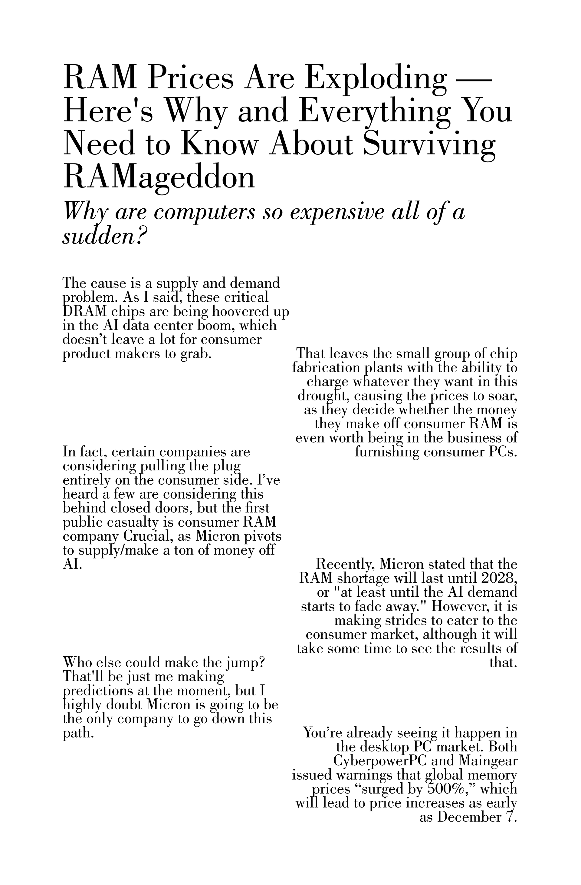
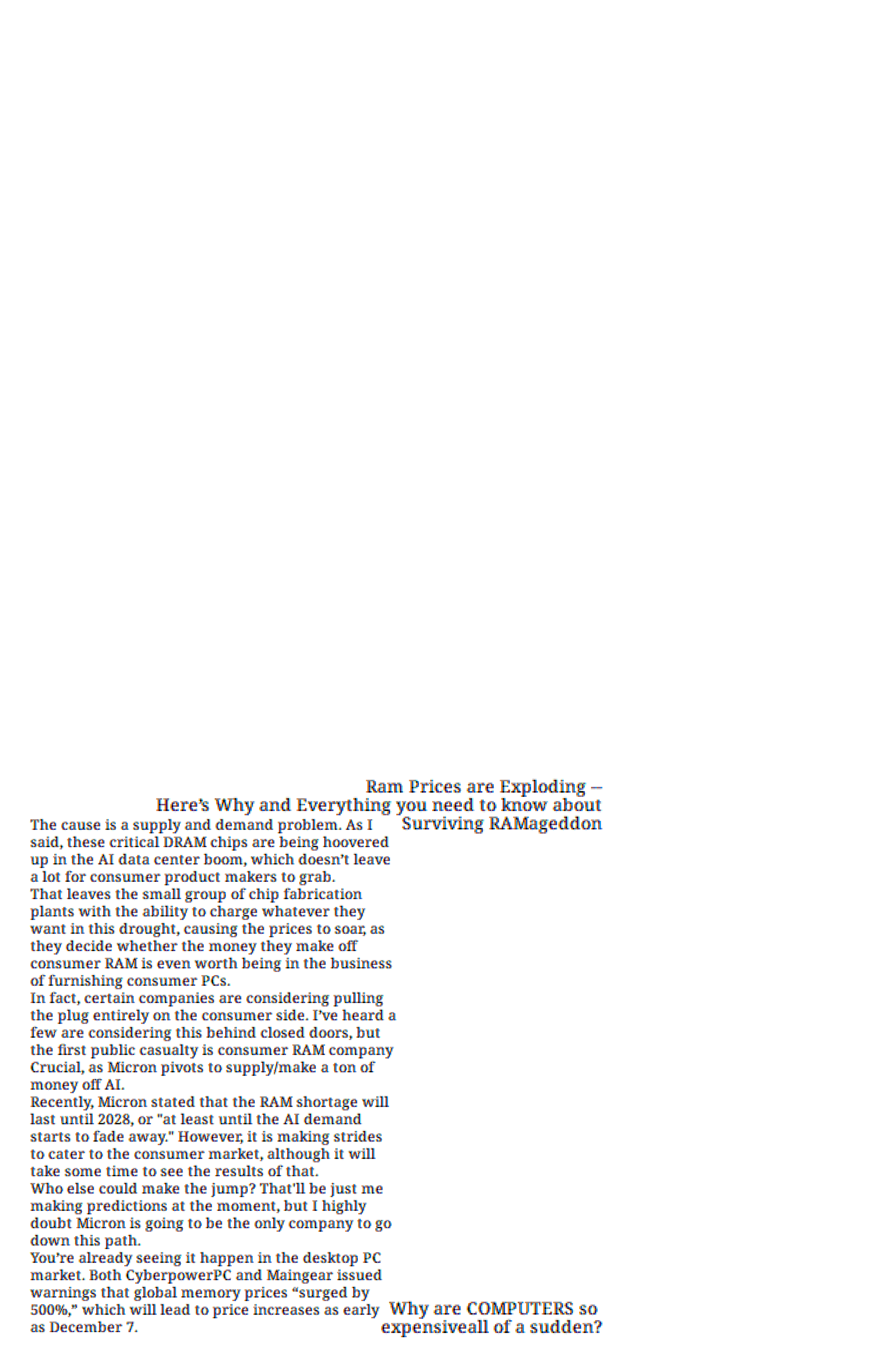
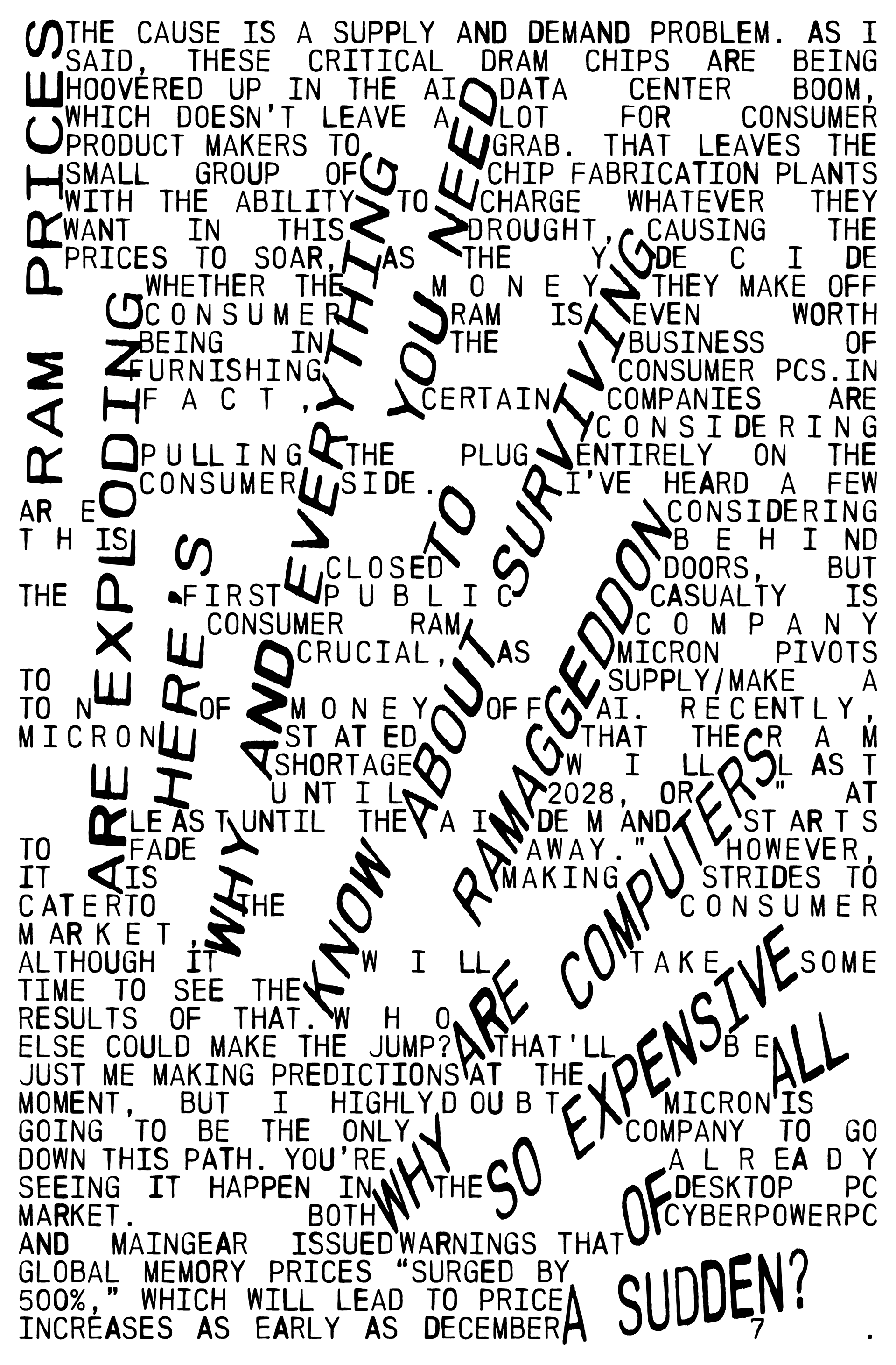
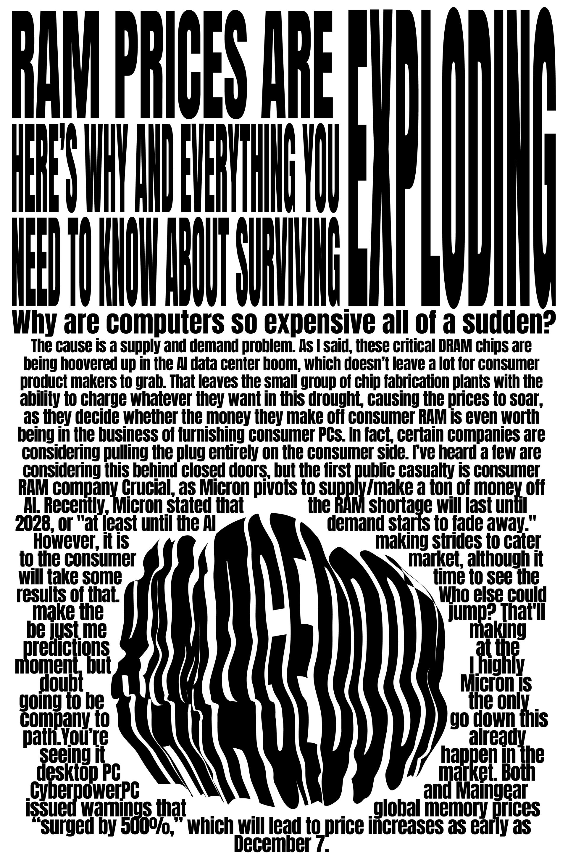
Typography can behave like a system, not a one-off composition. In this assignment, you will design a typographic module that can generate multiple outcomes while staying coherent. You will create four distinct tonal “registers” for the same text using typographic rules and craft.
The tonal registers for mine are (left to right) formal, intimate, playful, and urgent. This assignment was pretty rudimentary, and for each register I created a ruleset of 3 rules to keep in mind while designing. Formal is inspired by online articles and essays, intimate by poems and text, playful from the Red Wedge by El Lissitzky, and urgent from storefront sale advertisements and old newspapers.
Assignment 02 - Narrative Typography: Memory + Anticipation
03/11/2026
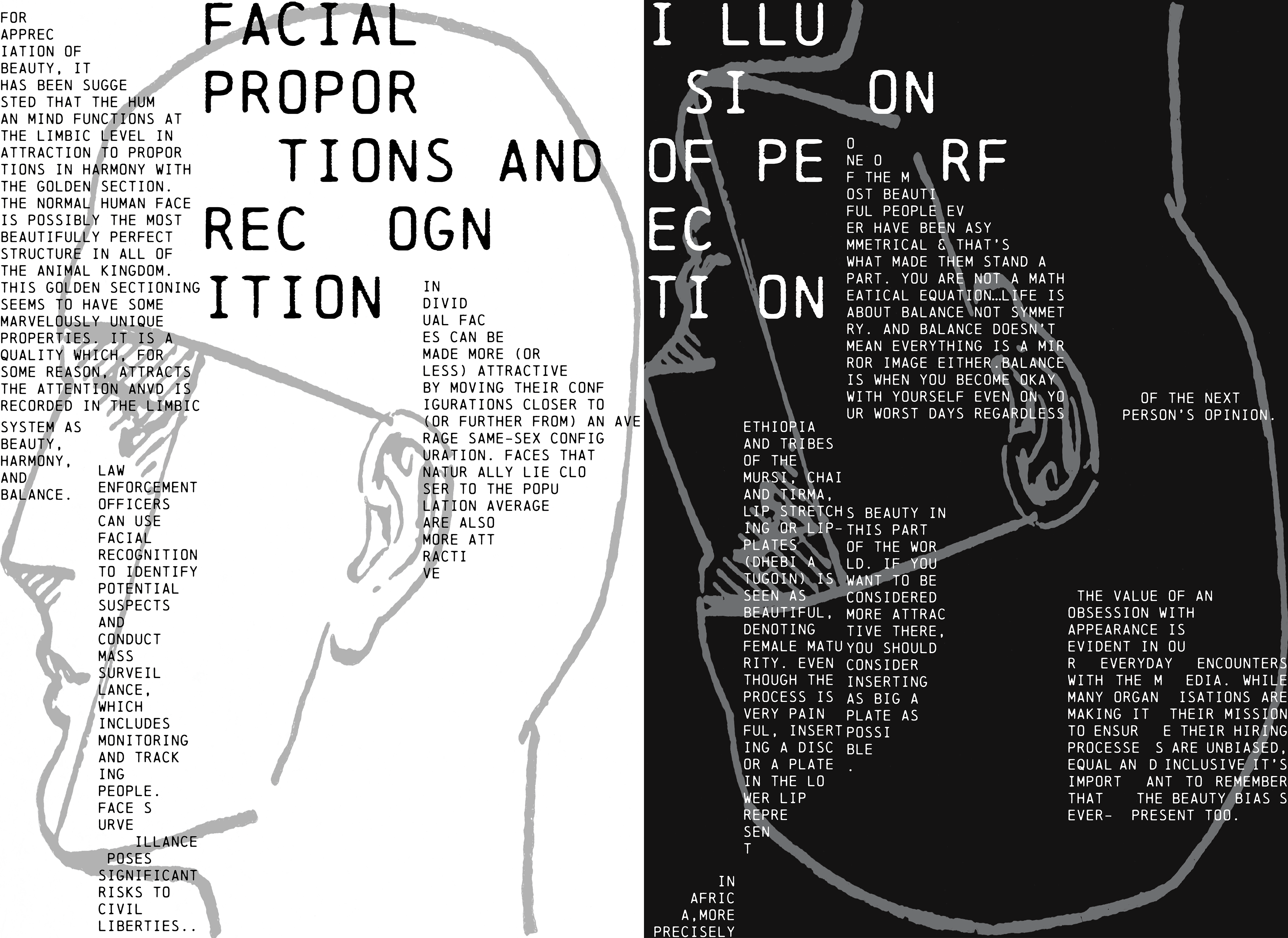
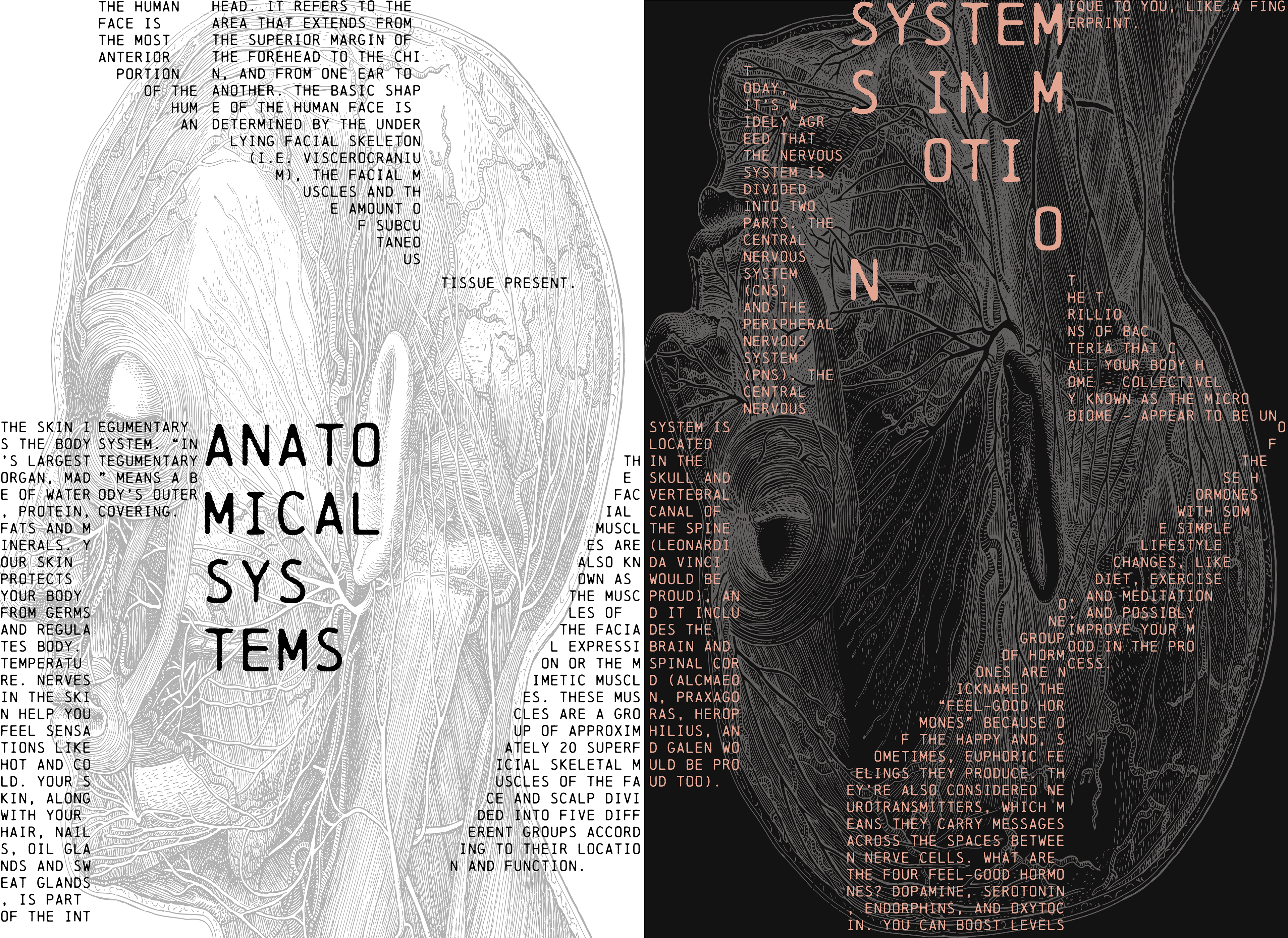
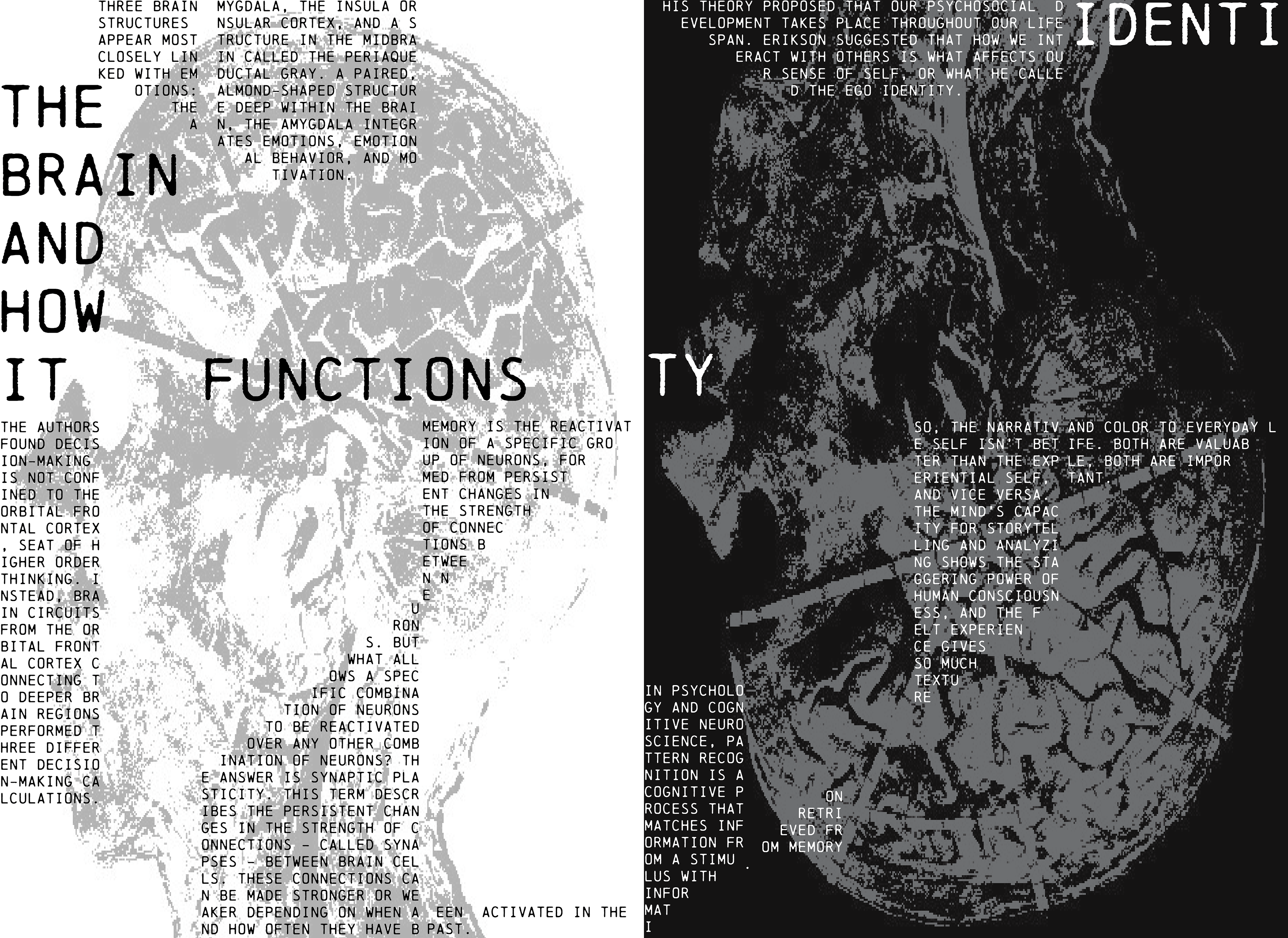
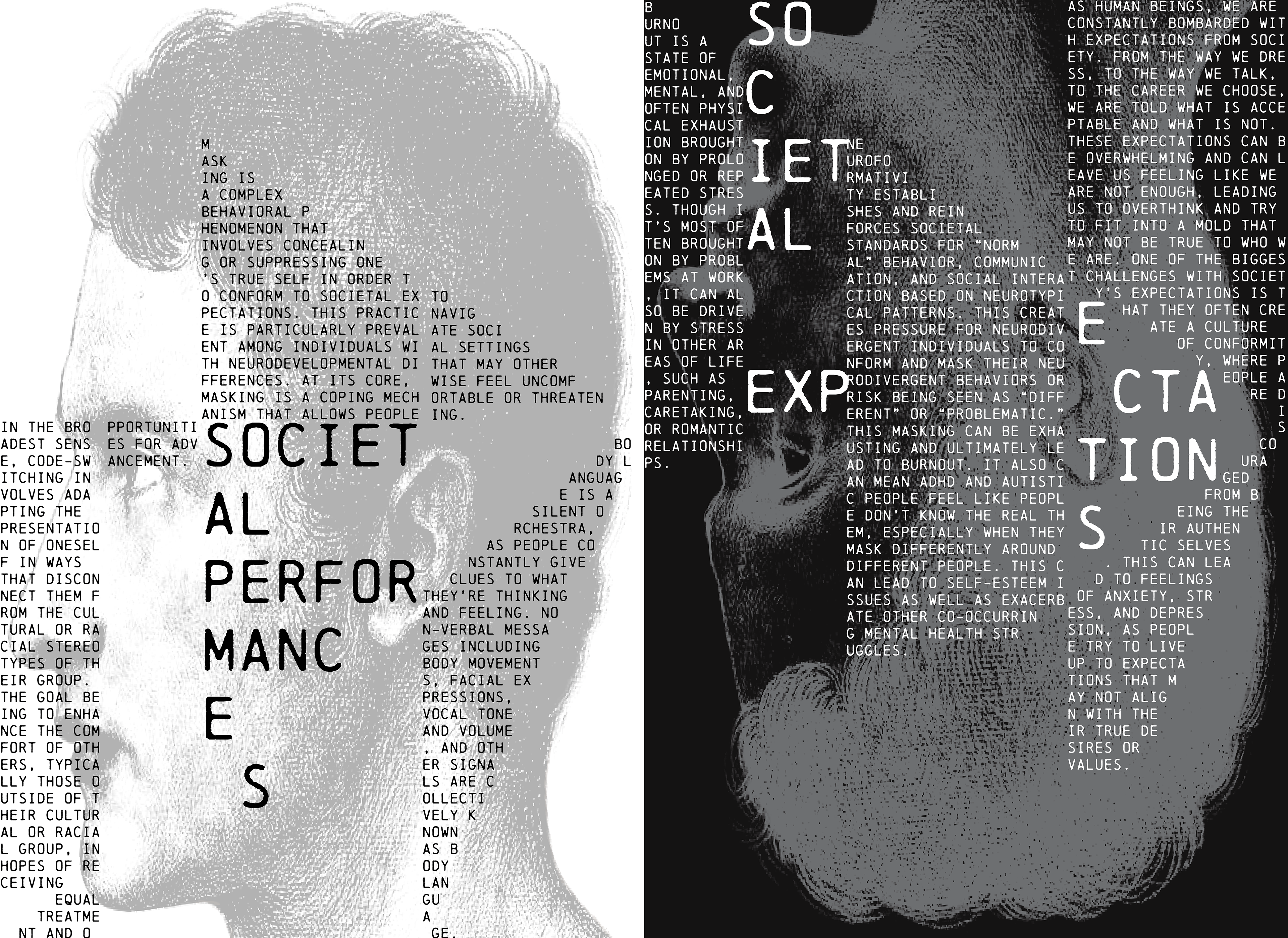
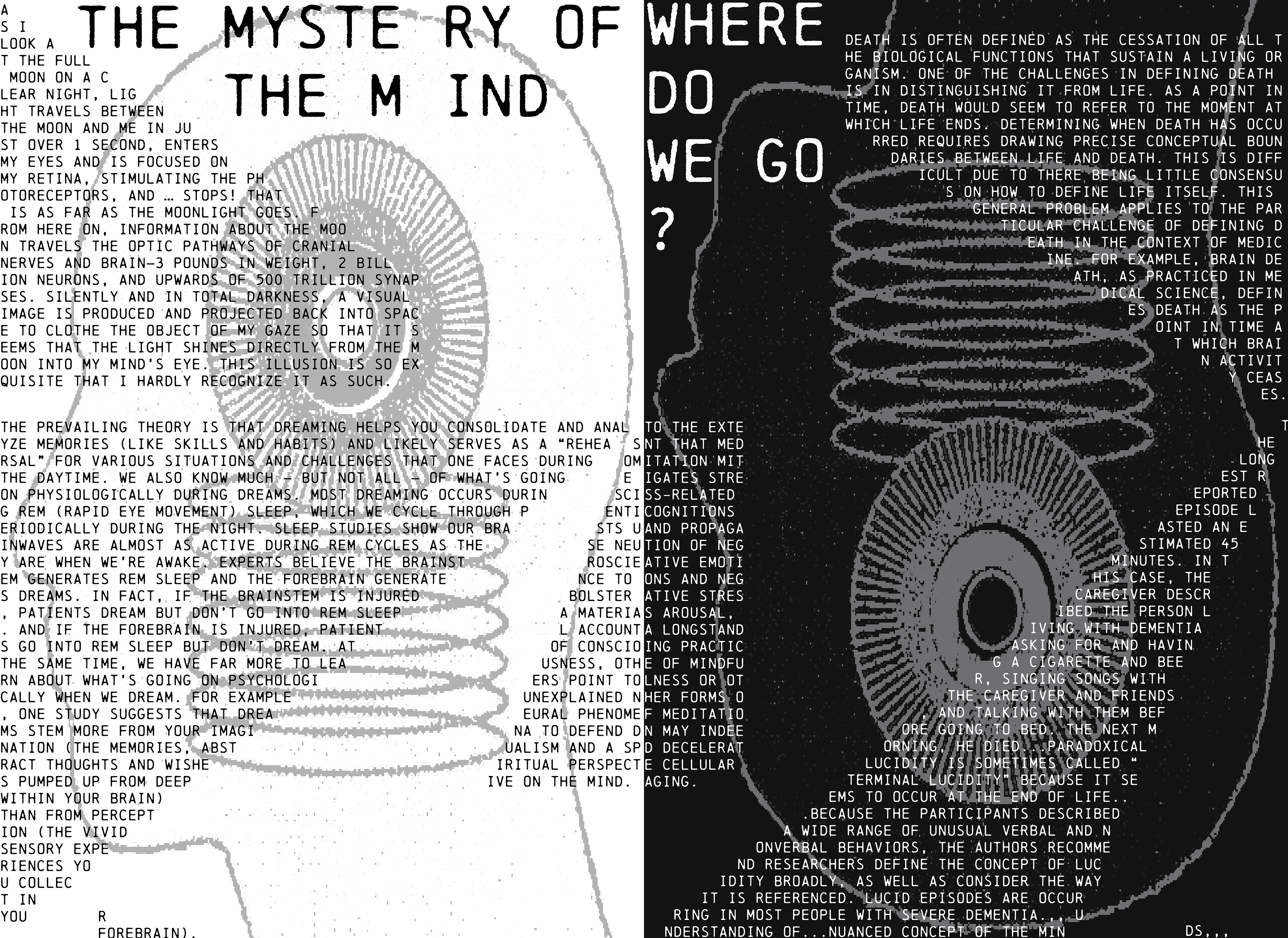
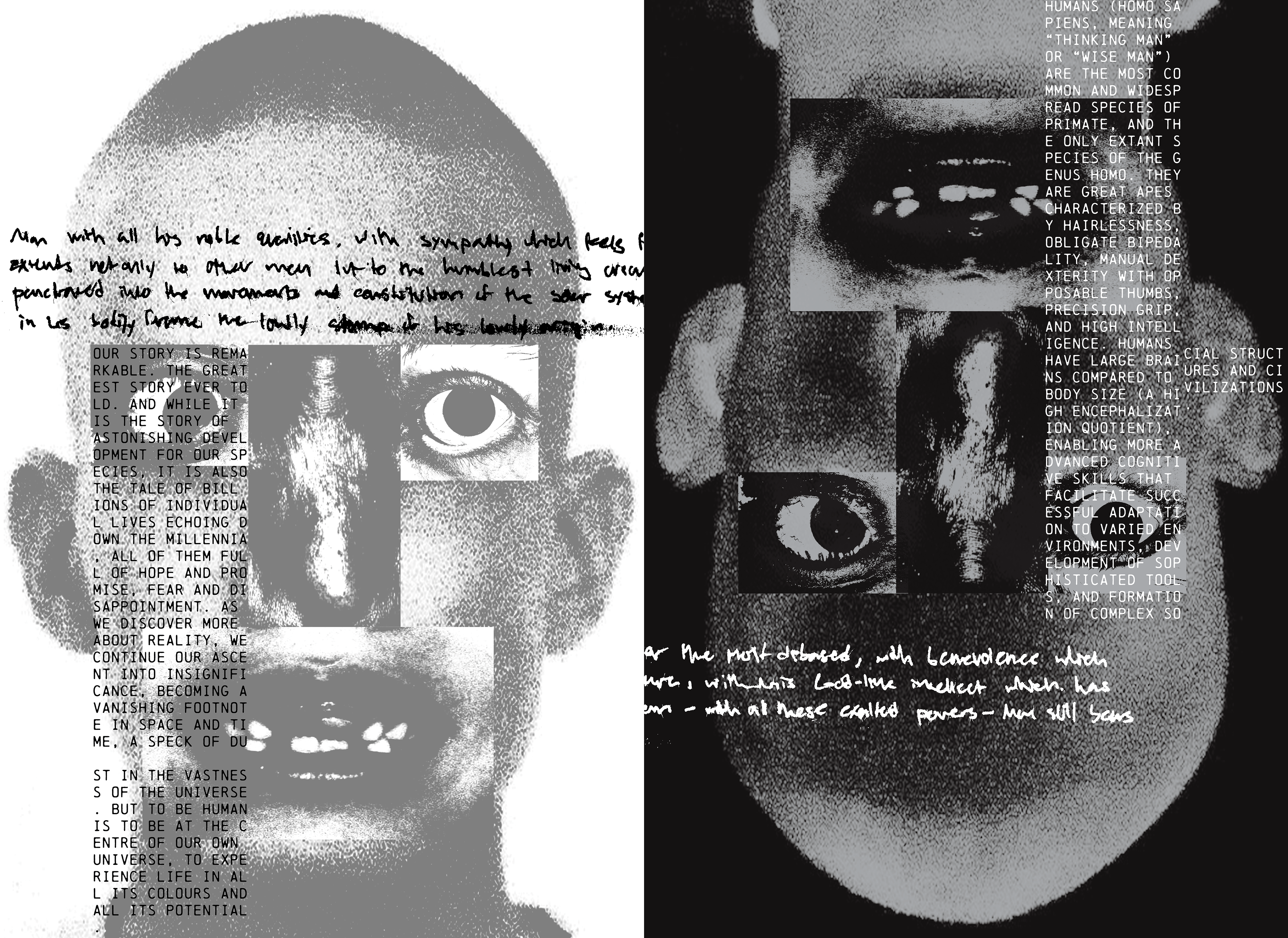
In publications, typography does more than “look good.” It creates continuity. It sets pace. It builds expectations. In this project, you will design a short typographic sequence where each spread feels connected to the next. The goal is to make a series that has a clear voice and a clear structure, while still allowing moments of change. You will treat the grid as the repeating structure that carries the story across pages. It can stretch, compress, break, or shift depending on what the content needs.
For my submissions, I constructed a grid based off of a simplified woodcut from Divina Proportione by Luca Pacioli depicting a grid over a mathematical rendition of the human face. The spreads (from left to right) delve into human experience, each spread depicting a different layer (Physical, Biological, Neural, Social, Metaphysical, and Human) while keeping within the same grid except for the last where the grid breaks for emphasis and to represent the change of focus from just parts to the whole.
Assignment 03 - Ecological + Vernacular Typography
04/15/2026
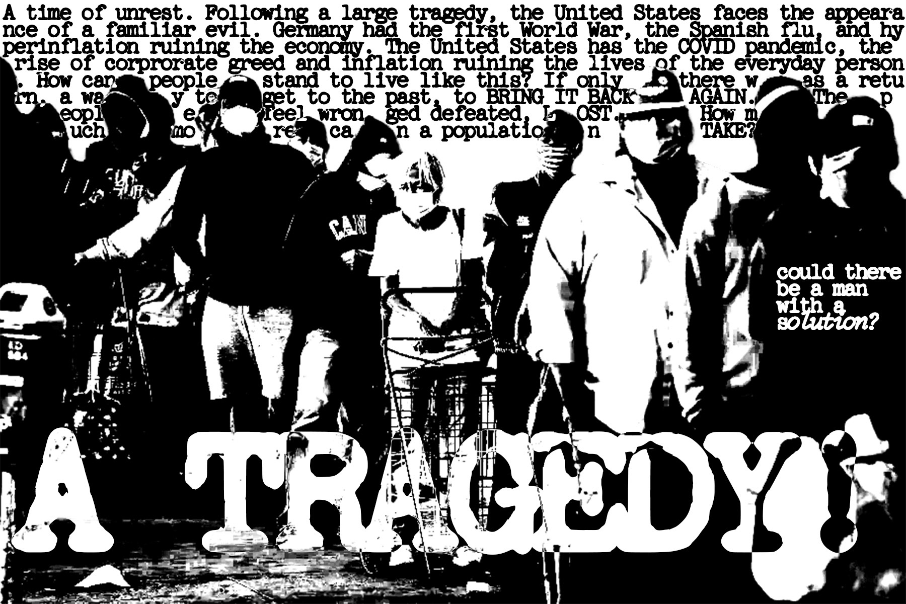
In this project, you will build a typographic system that takes its rhythm from a real cycle or flow. Your goal is to make time and context visible through typographic pacing, not illustration. The cycles could be literal or abstract and had to be in two forms: micro strip (handheld) and macro strip (spatial).
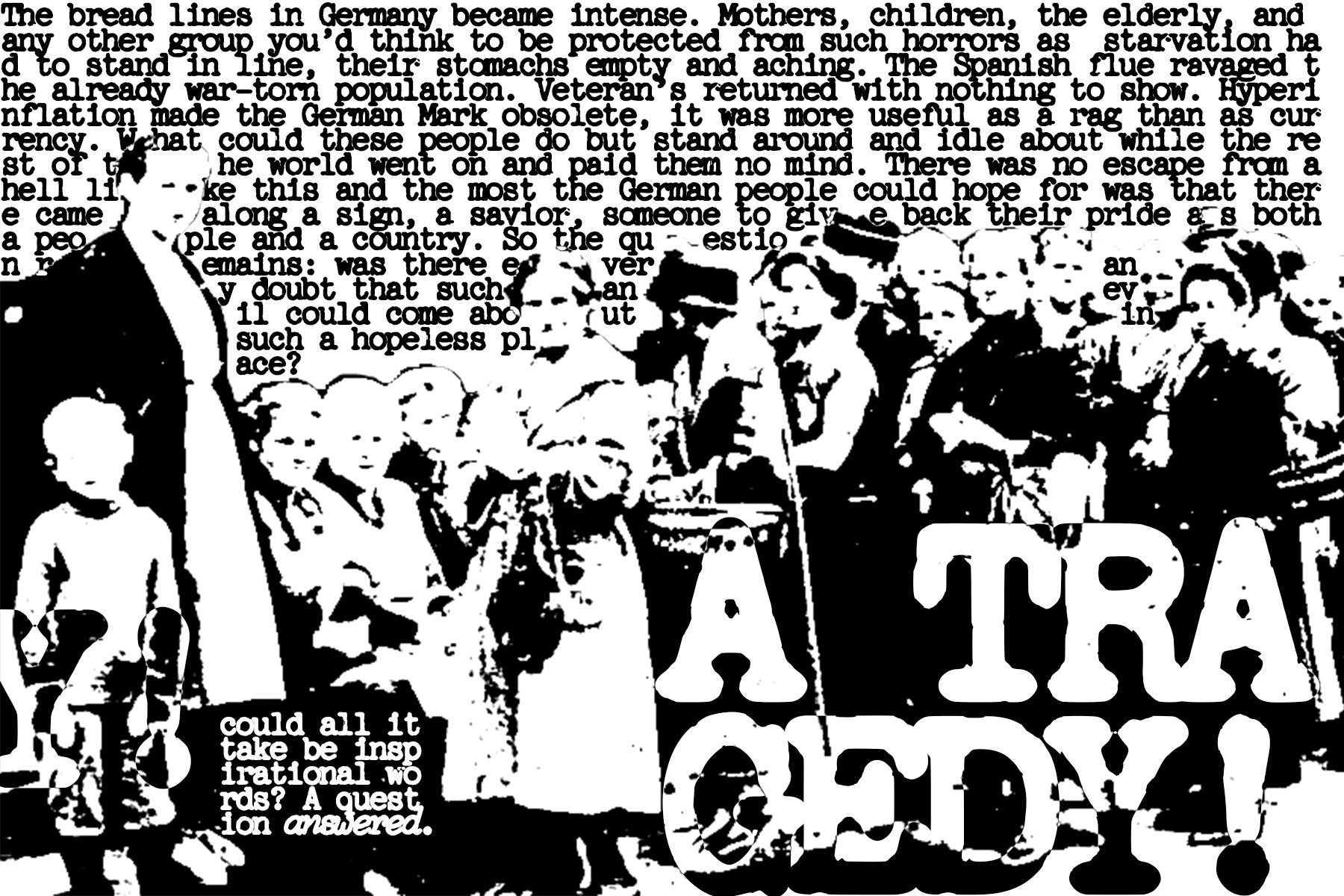
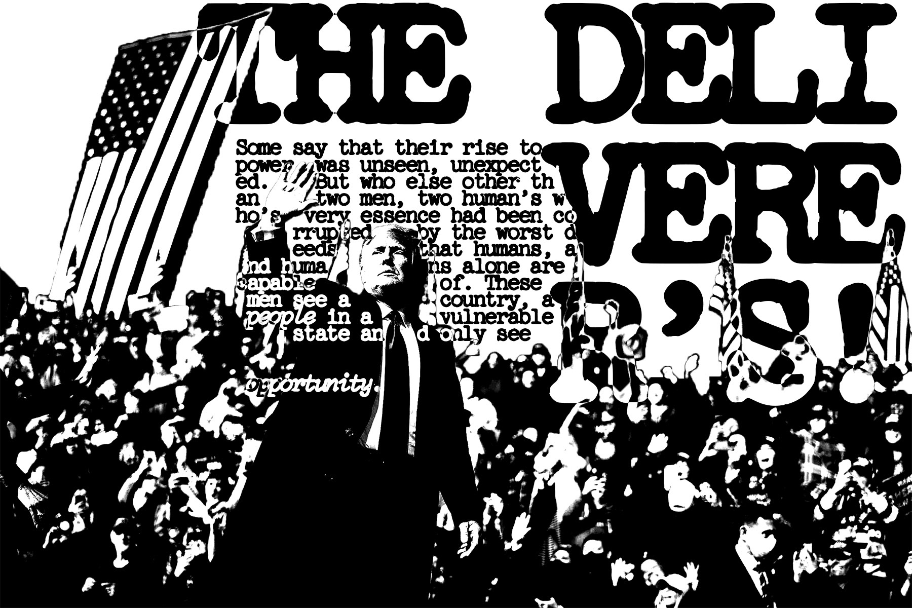
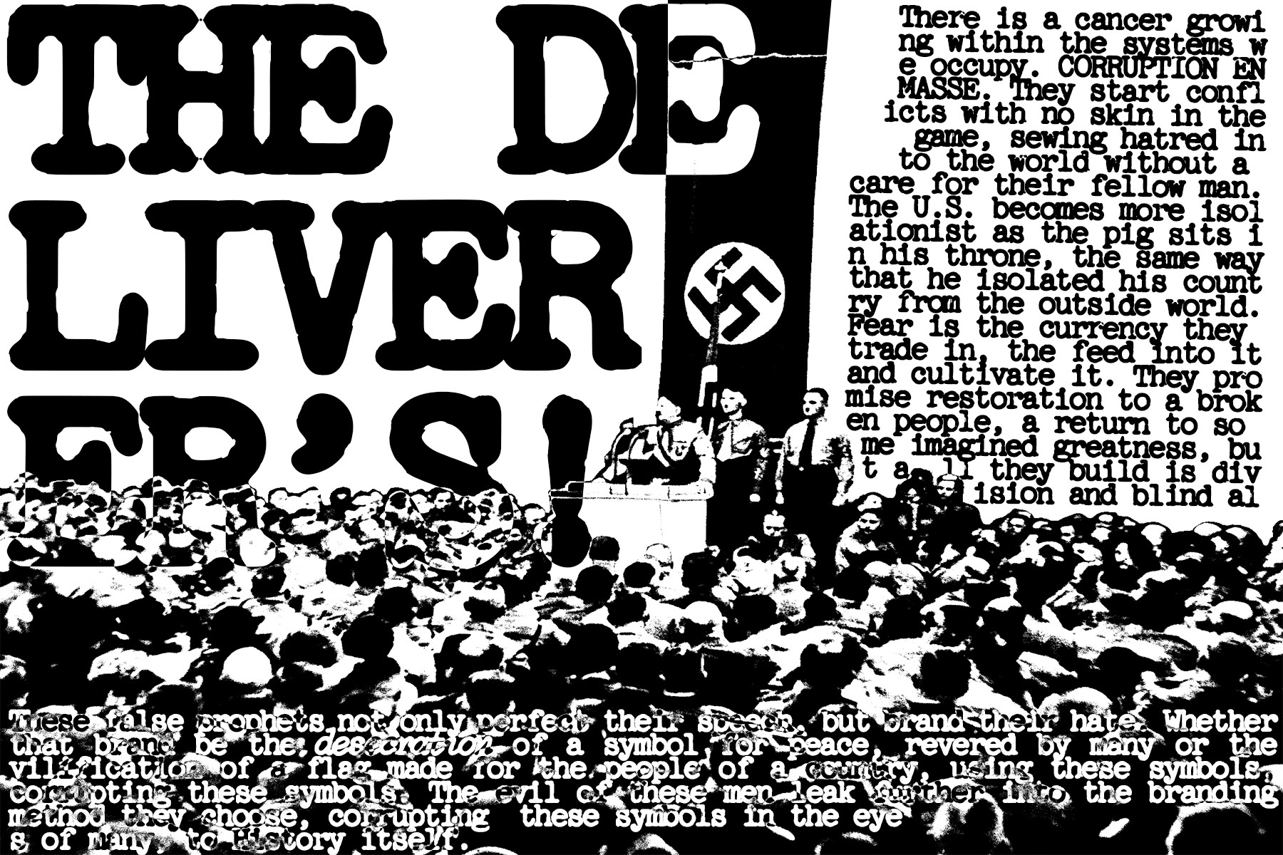
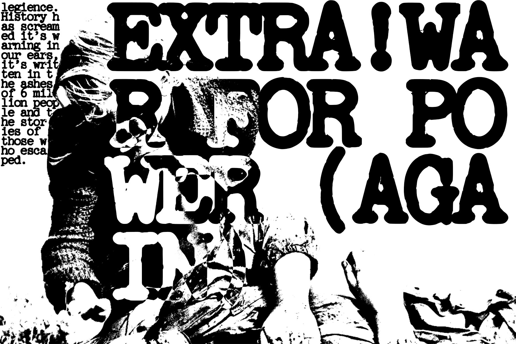
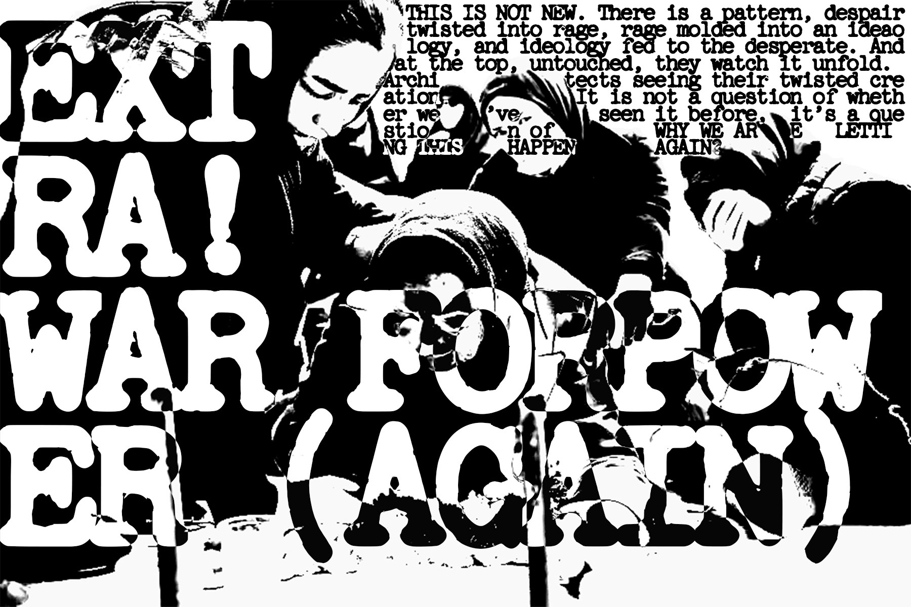
For my submission, I focused on the 'cycle' of Fascism rising in countries after hardship. I did this by showing parallels between post-ww1 Germany and post-COVID United States and introducing parallel images of starvation, the evil's rise to power, and the human cost after it all. The micro strip was made to be printed onto cotton bandage strips and the macro were created as slides for a vintage carousel projector, both circular and cyclical in nature.

Interactive Design II
05/13/2026
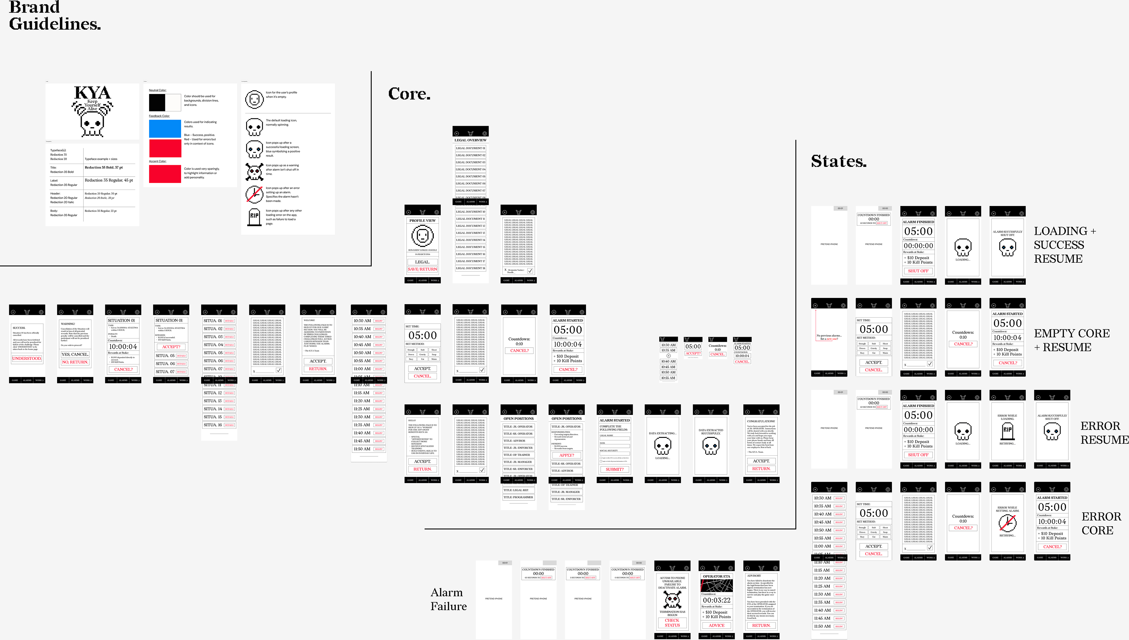
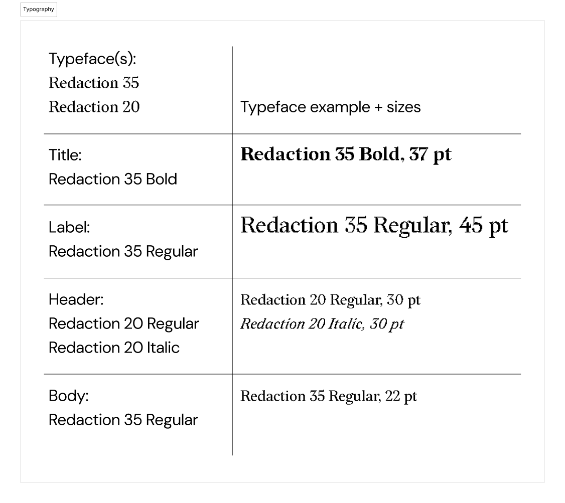
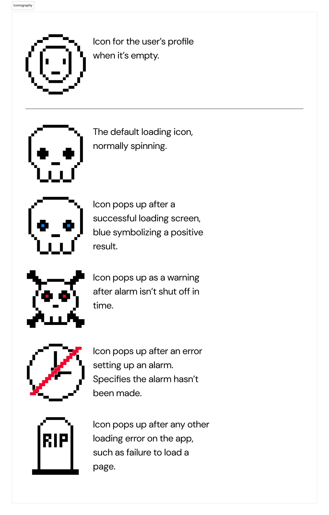
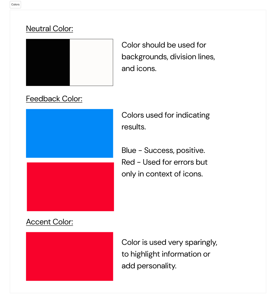
We were to create one app by the end of the semester, brand guidelines and all. For my app concept, I went with something out of the ordinary to keep myself engaged: an alarm app that's main appeal is risking your life and cash rewards in order to keep yourself on time. It's a ridiculous concept, but the main focus was to refine my UI/UX skills further despite that. Below are the main brand guidelines along with the wireframe, the journey map, and all of the screens and states. There's also the working prototype which I embedded.
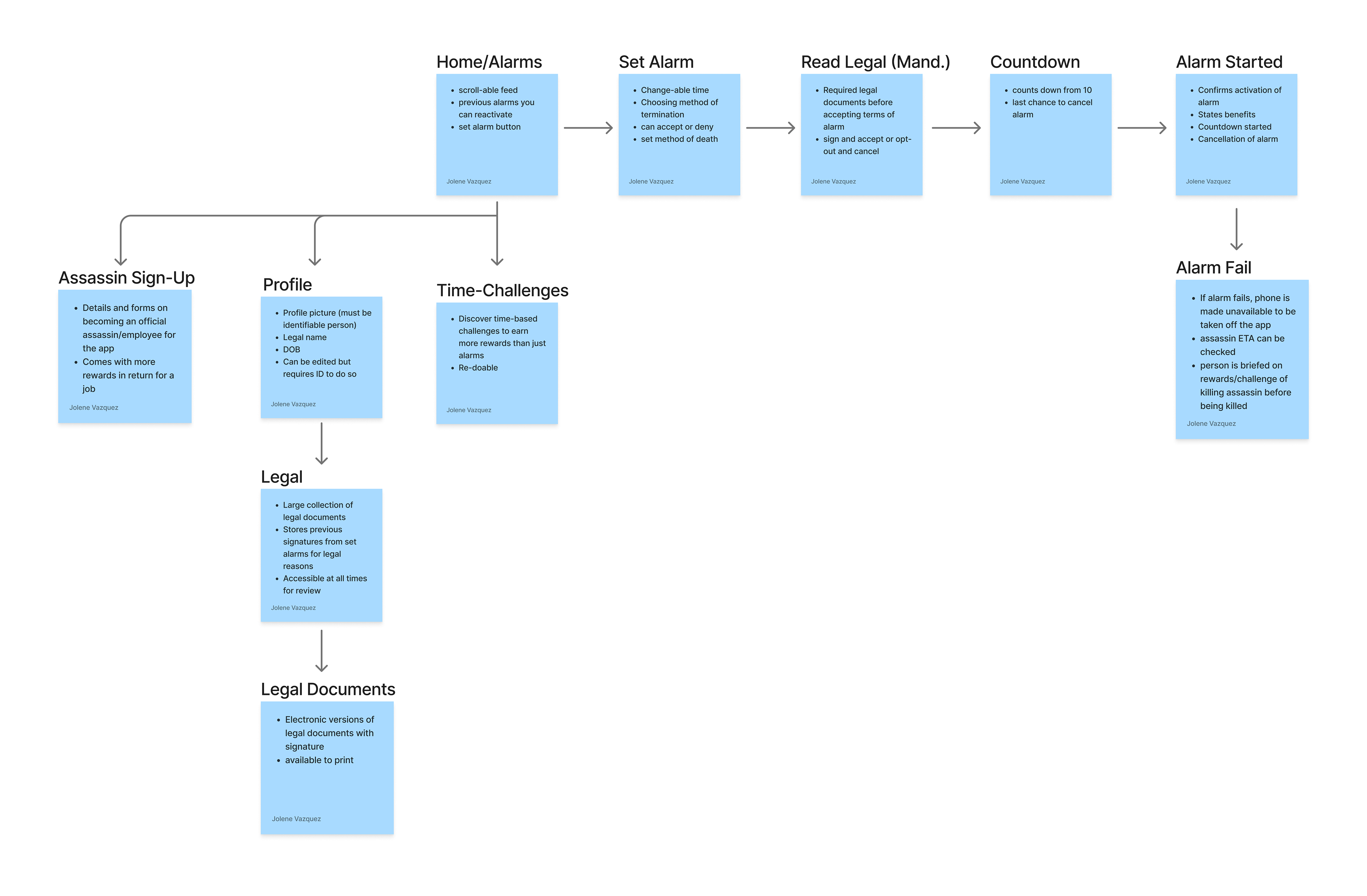
wireframe
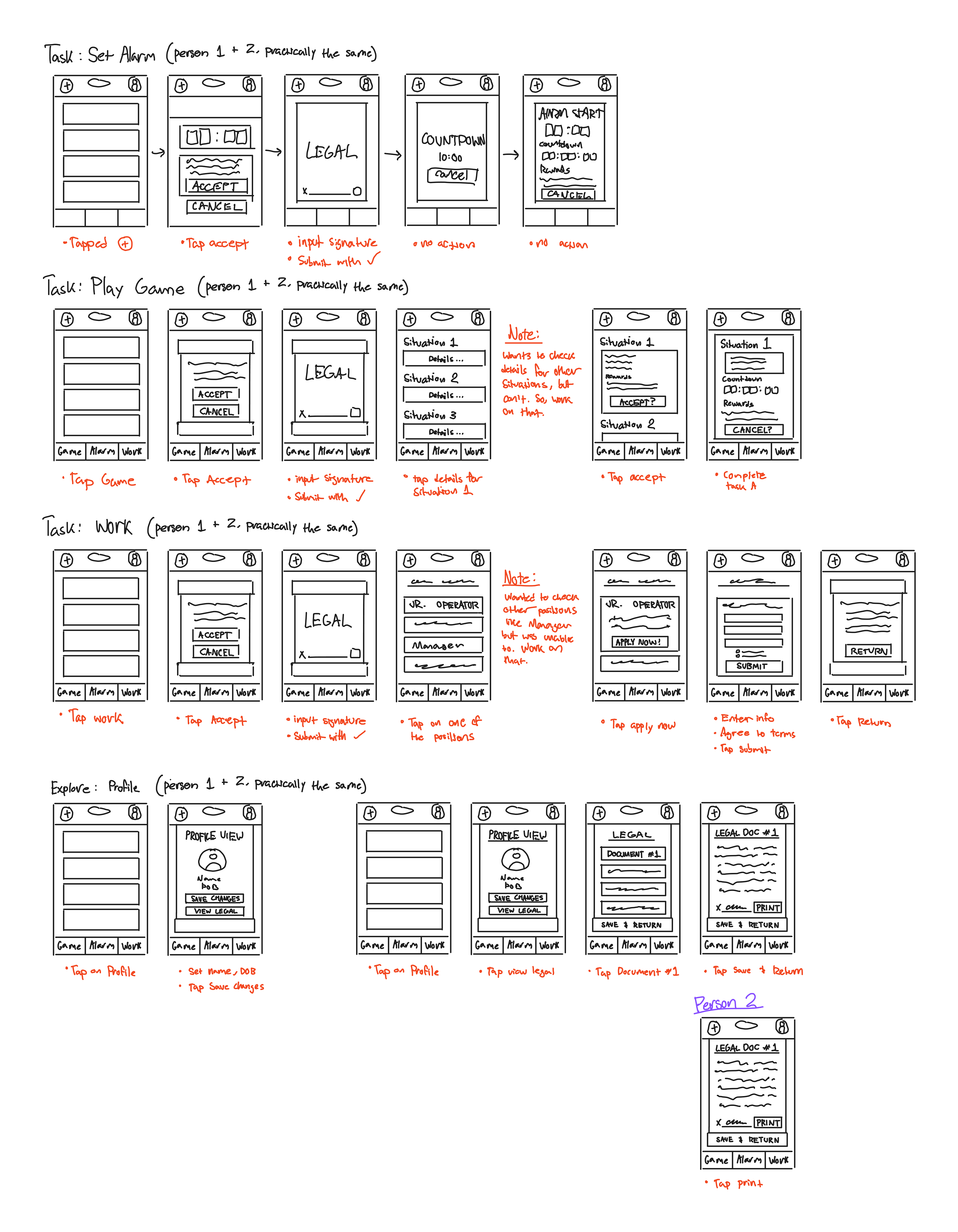
journey map